CAP
Branding
Editorial
Environmental
Digital
Typography
Corporate Id.



brand
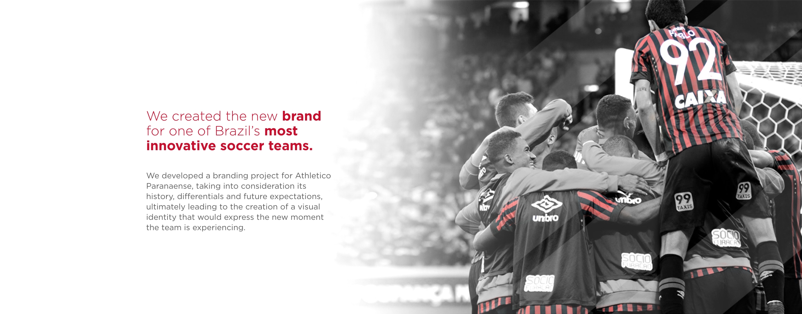
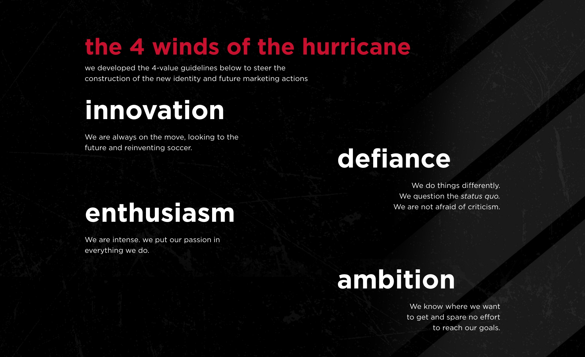
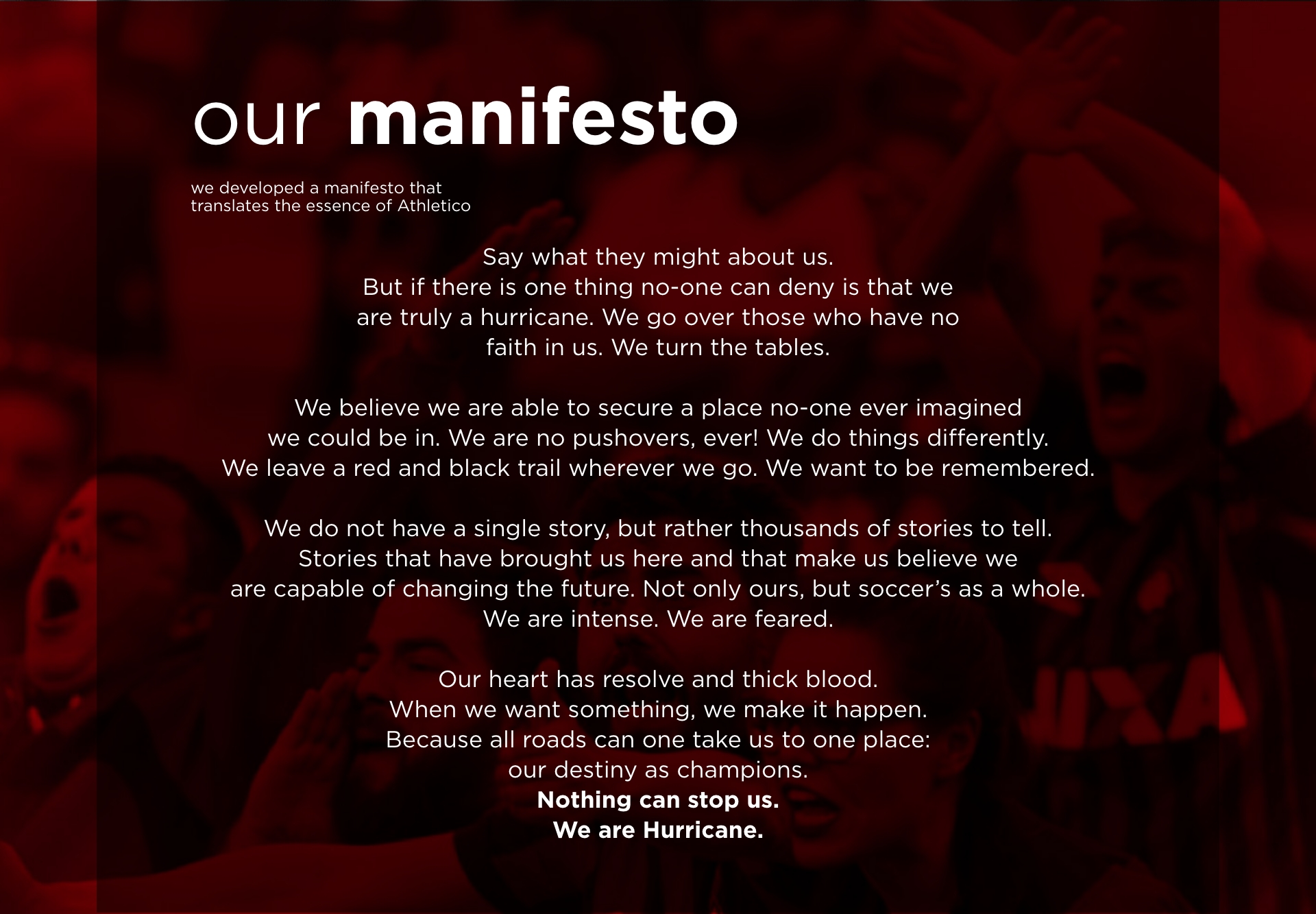
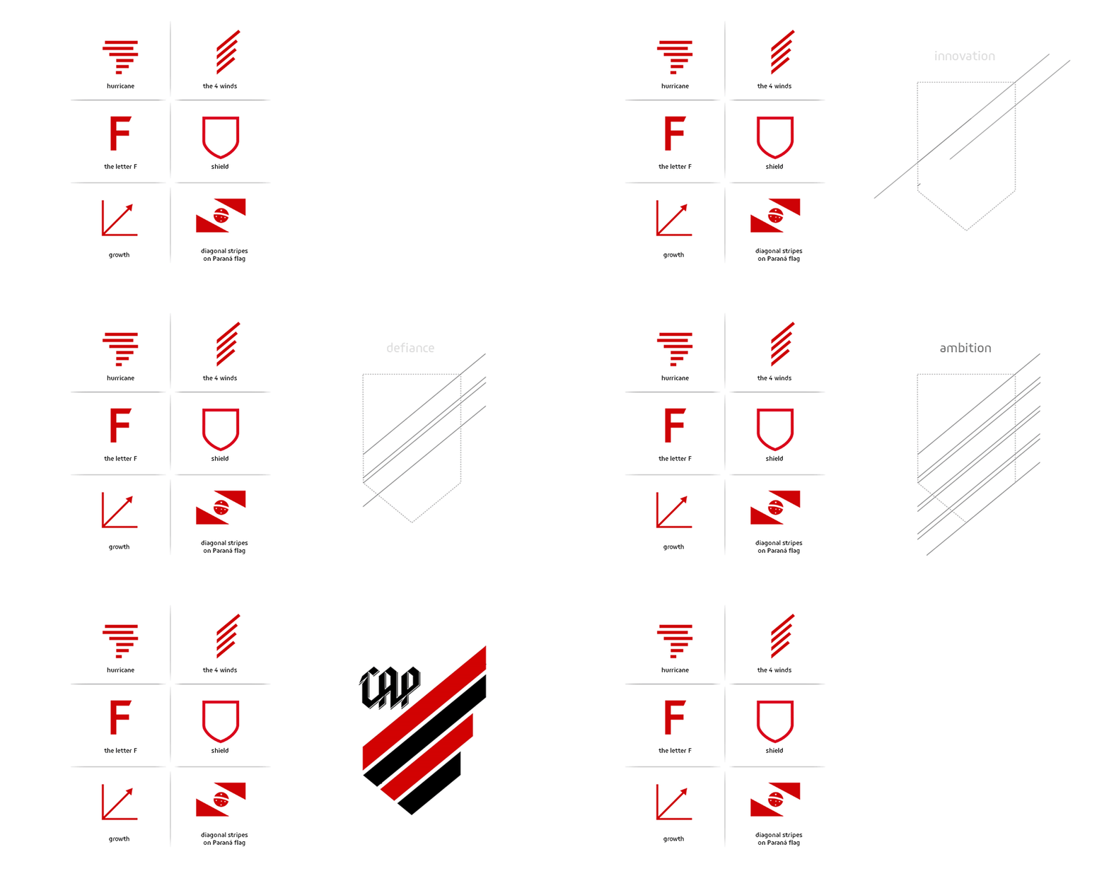
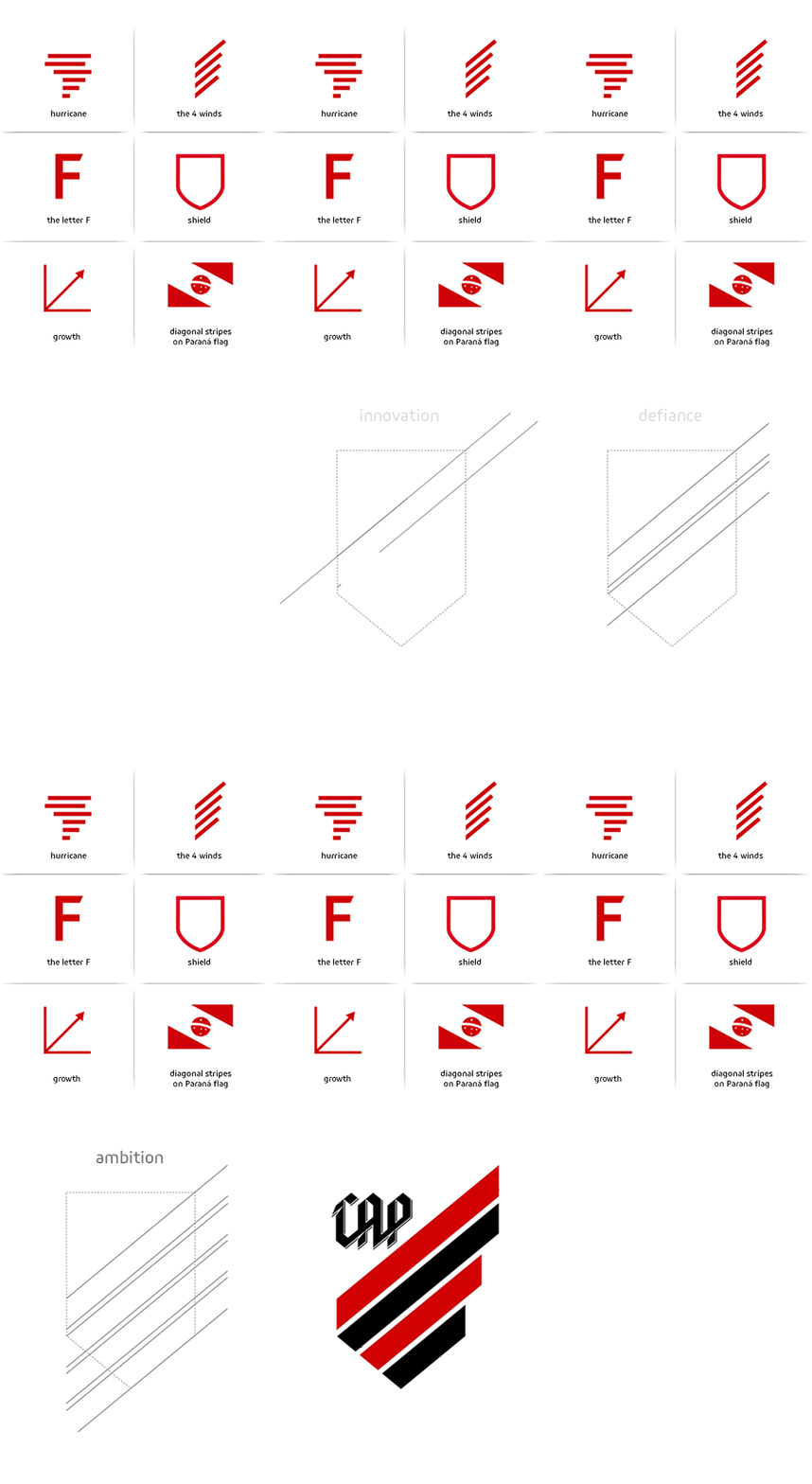
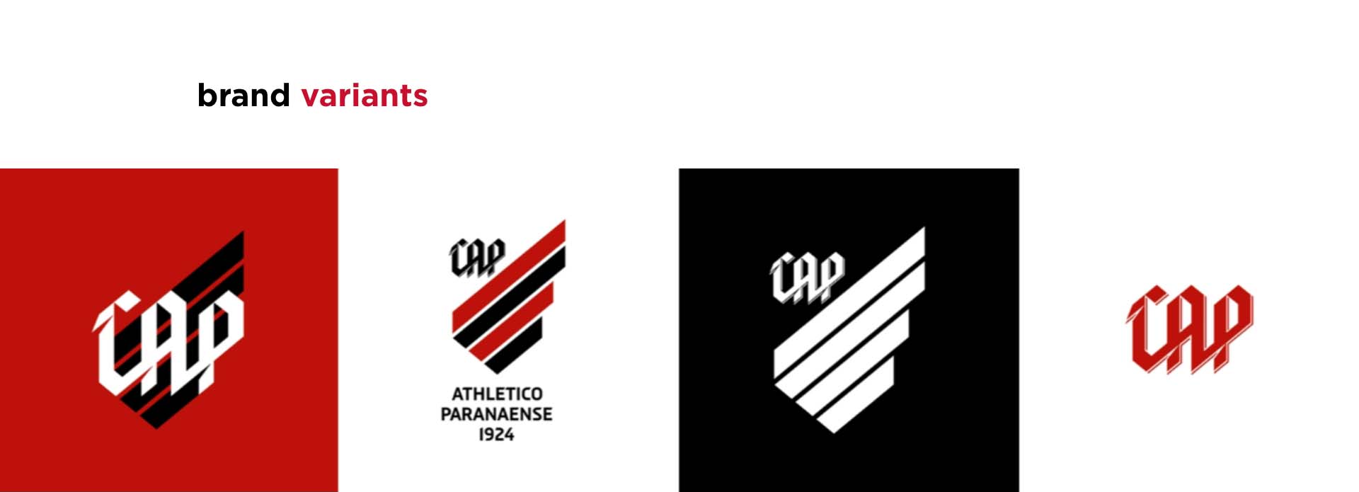
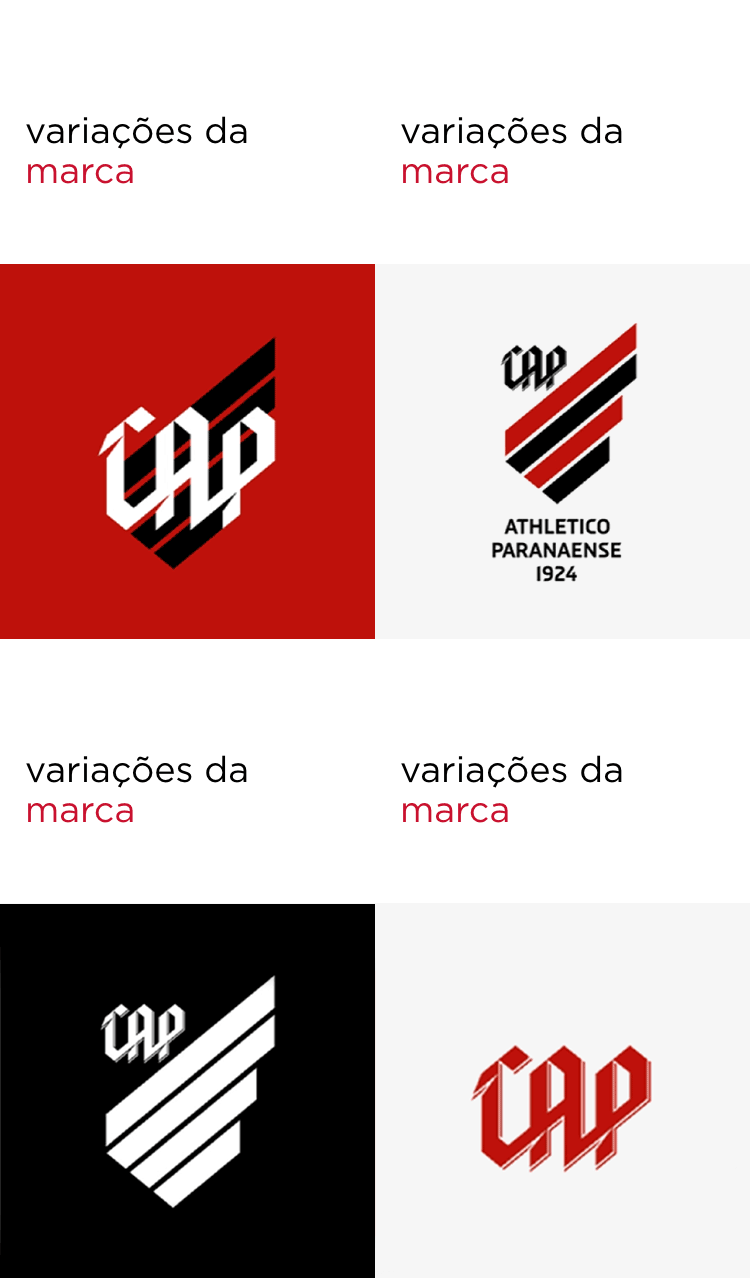
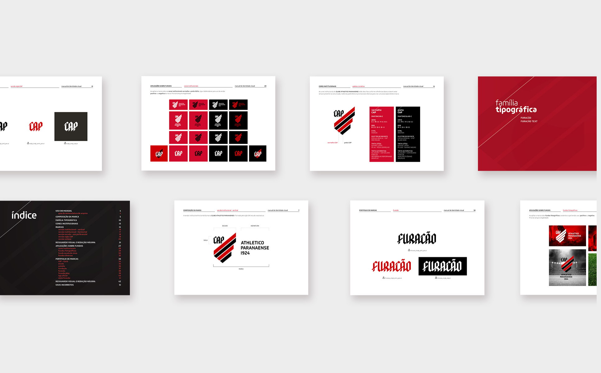
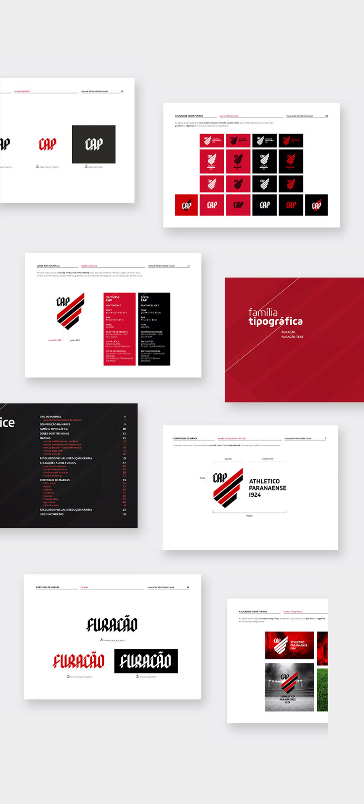
Not only does the brand carry the history of the soccer team, but also all its differentials and future aspirations, resulting in a unique brand, different from everything found in Brazilian soccer today.


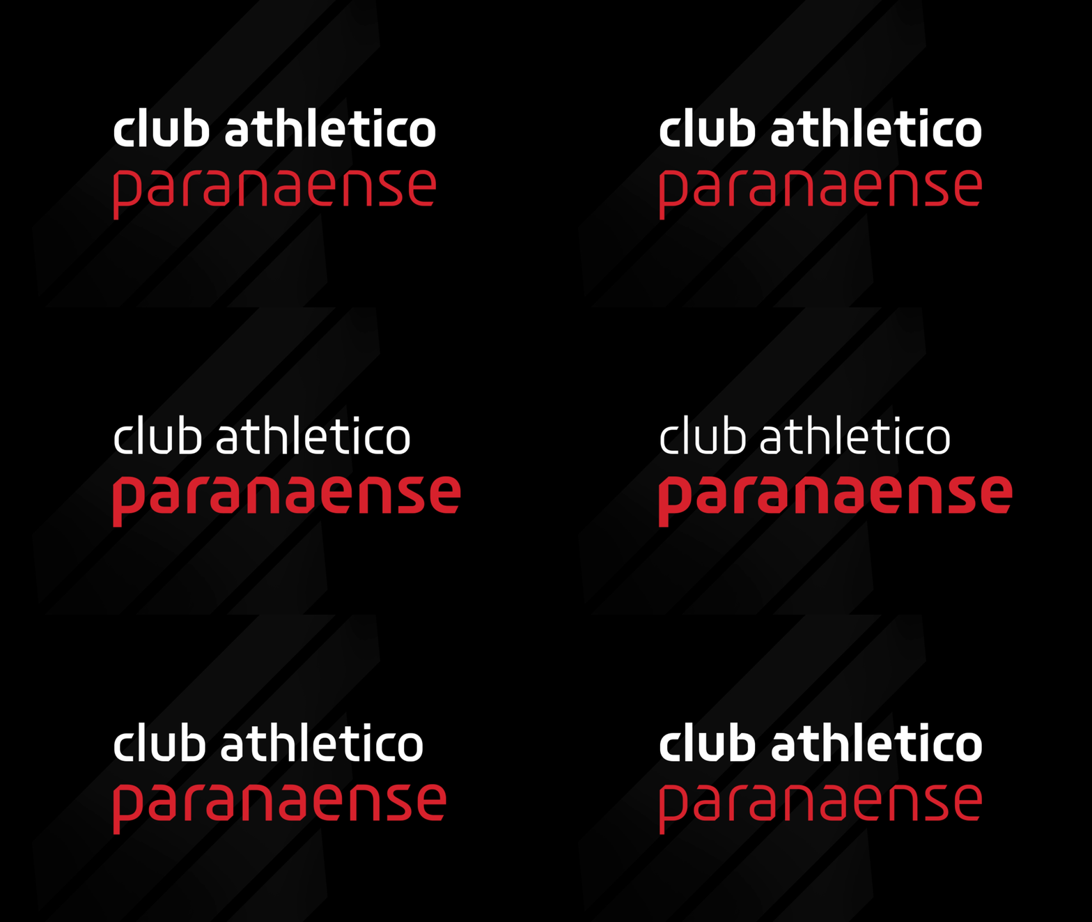
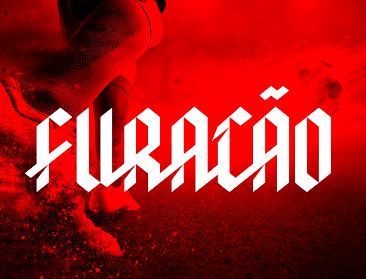
hurricane font family
Partnering with Fabio Haag Type, we developed an exclusive font family to the hurricane. A proprietary font is a powerful tool to build a solid identity once all communications will be done in bespoke style.
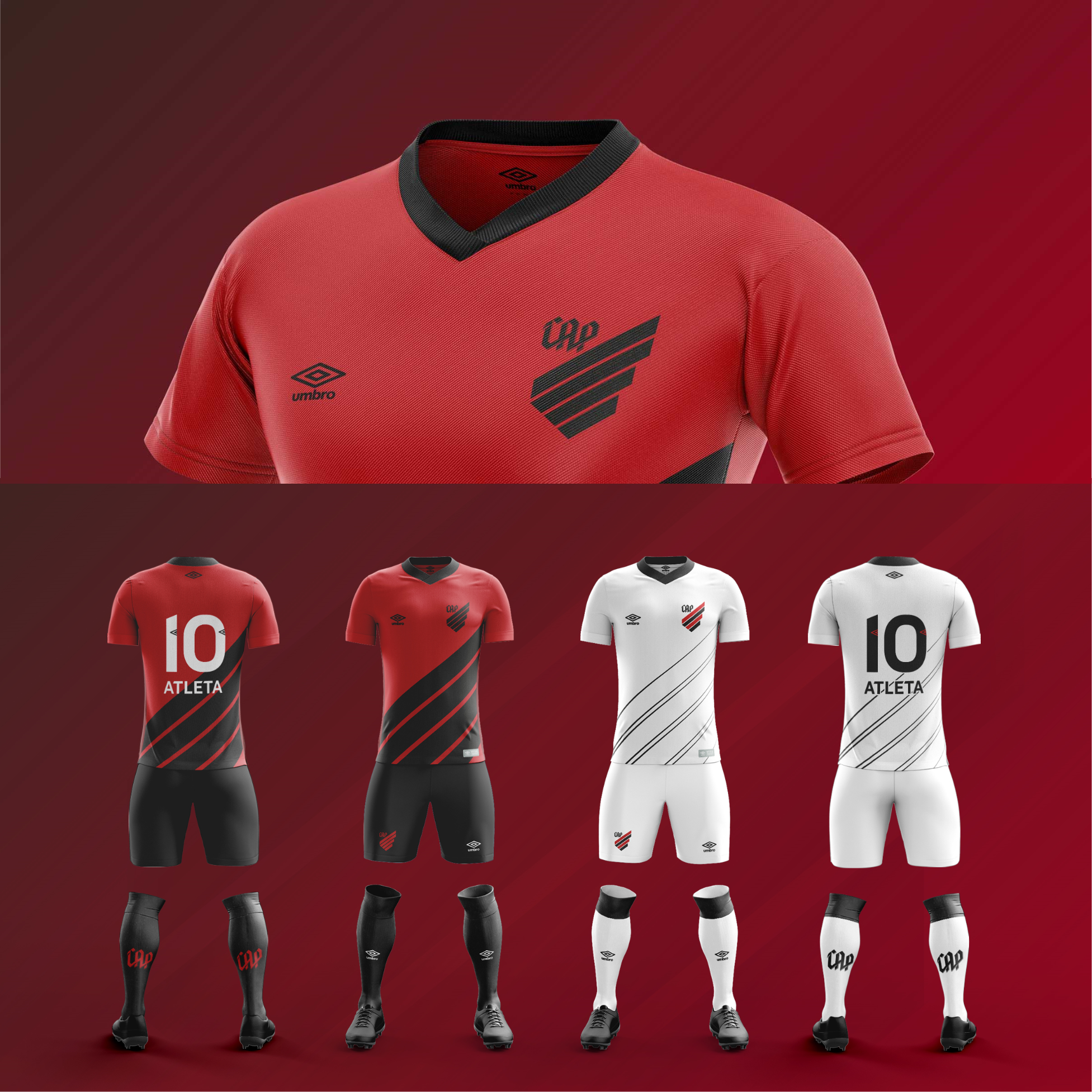
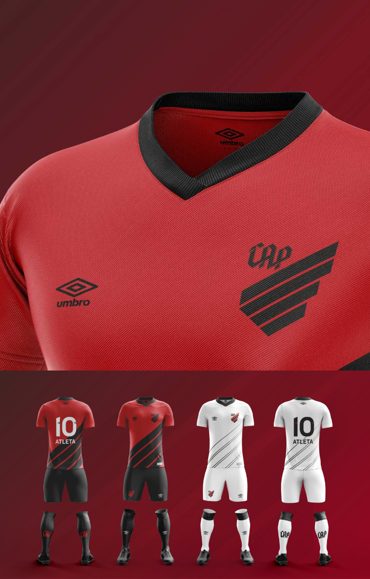
In the case of Athletico Paranaense, the importance is even greater. A soccer team's primary expression of identity is unquestionably its uniform. Therefore, the number on the back of the jersey plays an important role for the image. As such, the numbers' having a unique design, different from the numbers on all opponents contended with in the field, becomes a major differential.
Photos of typographic studies, below, by Fabio Haag.


brand architecture





who made
it happen

Vannucchi

Mazini

Keating

Poppovic

Senra

Martins

Nasraui

Leal

Kapaz

Fonseca

Ivamoto

Rocca
check out
other cases
We use cookies to improve your experience on our website. By continuing to use our website, you agree with our Privacy Policy.

